
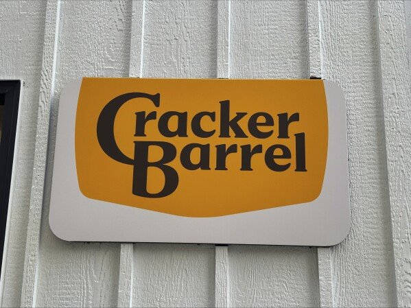
Cracker Barrel old logo return has become one of the most talked about branding stories of the year. The family-style restaurant chain, famous for its Southern charm and country store experience, made headlines after deciding to bring back its traditional “Old Timer” logo. The reversal came quickly after the company faced intense backlash from customers, commentators, and even political leaders when it introduced a modernized design.
This case shows how deeply branding can influence public opinion and how loyal customers often react strongly to changes that threaten tradition. The story also reflects the growing intersection of business decisions, culture, and politics in the United States.
The New Logo That Sparked Backlash
Earlier this month, Cracker Barrel introduced a new streamlined logo. The design was clean and modern, featuring the company name inside a yellow hexagon and removing the iconic “Old Timer” figure sitting beside a wooden barrel. The move was part of a larger plan to refresh the brand, attract younger diners, and create visuals that worked well in digital formats.
Company leaders argued that a simplified look would better fit apps, mobile screens, and modern signage. It was tied to broader upgrades, including updated menus, redesigned interiors, and other efforts to appeal to a wider audience. On paper, the strategy made sense. In practice, however, the response was swift and negative.
Backlash From Loyal Customers
For decades, Cracker Barrel has been seen as a symbol of nostalgia, comfort, and Americana. The “Old Timer” logo, in place since the late 1970s, was more than just a design. To many, it represented family road trips, hearty breakfasts, and a sense of tradition that felt timeless.
When the company unveiled the new logo, longtime fans felt that the heart of the brand had been stripped away. Critics accused Cracker Barrel of turning its back on its roots in an attempt to appear modern and “woke.” On social media, customers vented frustration, with many saying the chain no longer looked like the Cracker Barrel they grew up with.
Political Pressure and Public Debate
The controversy soon spilled into the political arena. High-profile conservative voices joined the chorus of critics. Former President Donald Trump weighed in, calling on Cracker Barrel to admit a mistake and restore the old design. He framed the backlash as a sign that the company should listen to its customers, calling their opinions the “ultimate poll.”
The White House also picked up on the issue, with officials contacting company executives and publicly crediting themselves when the reversal came. In a politically divided era, even a restaurant logo became part of broader culture-war debates.
The unusual level of political attention highlighted just how sensitive branding changes can become when they touch on ideas of tradition, heritage, and identity.
Stock Market Impact
Beyond the political noise and customer frustration, the company also faced financial consequences. Shares of Cracker Barrel dropped sharply after the new logo was announced. Investors worried that the backlash could harm sales and deepen the challenges the company was already facing.
Cracker Barrel had recently reported slipping same-store sales and weaker retail performance. The logo controversy made things worse, as news headlines and online chatter focused less on menu upgrades and more on angry customers. By the time the old logo was restored, millions of dollars in market value had been lost.
The Swift Reversal
Faced with customer complaints, political pressure, and a falling stock price, Cracker Barrel moved quickly. Within days of the rollout, the company announced it would abandon the new design and bring back the “Old Timer” logo.
In a statement, Cracker Barrel thanked its guests for sharing their voices and reaffirmed that the chain would always stay true to its heritage. Executives explained that the company listened to feedback and realized the importance of preserving a logo that symbolized hospitality, comfort, and tradition.
The decision was praised by loyal fans who had spoken out. Many celebrated the return of the old design, saying it felt like the company had remembered who it was. Even critics who mocked the rollout acknowledged that Cracker Barrel had avoided a long-term crisis by reversing course so quickly.
Why the Old Logo Matters
The Cracker Barrel logo is not just a picture. It is tied to the company’s entire identity. The “Old Timer” figure leaning against a barrel conveys a sense of rural Americana that fits perfectly with the chain’s rocking chairs, general store, and homestyle cooking.
For regular customers, removing that image felt like removing part of the experience. Branding experts often warn against making drastic changes to iconic visuals without extensive testing. In this case, the company underestimated how much emotional value people placed on the logo.
Unlike menu tweaks or interior updates, which can evolve over time, a logo represents permanence. Once it changes, customers feel like something familiar has been taken away. Cracker Barrel’s quick retreat proved that the old design still carries powerful meaning.
Social Media Reaction
Online reaction to the reversal was mixed but mostly positive. Many customers said they were relieved that the company listened. Others joked that Cracker Barrel had accidentally pulled a “New Coke” moment, referring to Coca-Cola’s disastrous attempt to change its recipe in the 1980s before quickly reverting back.
Comment threads and forums pointed out that the controversy may have ironically given Cracker Barrel more publicity than it has had in years. Even those who do not eat at the chain were suddenly aware of its branding drama. In that sense, the episode served as both a cautionary tale and a marketing boost.
Lessons for Branding
The Cracker Barrel old logo return highlights important lessons for businesses. Heritage and nostalgia are powerful forces that should not be underestimated. While modernization is often necessary, it must be done carefully and with respect for what customers love most.
Companies should involve their loyal audience in decisions that impact brand identity. Surveys, focus groups, and small tests can prevent larger mistakes. Transparency also helps. Explaining why changes are made and showing sensitivity to customer concerns can ease transitions.
Finally, brands must remember that visual identity is often tied to emotion, not logic. A logo is more than an image—it is a symbol of memories, values, and connection.
Looking Ahead for Cracker Barrel
Now that the old logo has returned, Cracker Barrel faces the challenge of moving forward. The company must repair trust with customers while continuing its efforts to modernize menus and interiors. It must also rebuild investor confidence after the stock slide.
Attracting younger diners remains important, but the brand will likely focus on subtler changes that preserve its identity. Enhancing digital ordering, improving value, and updating dining rooms can be done without sacrificing the symbols that long-time customers cherish.
The story is not only about a logo. It is about balancing tradition with innovation in a way that keeps both loyal and new customers satisfied.
Conclusion
The Cracker Barrel old logo return is a vivid reminder of how branding decisions can spark national debates, influence markets, and even draw political attention. What began as an attempt to refresh the company’s image turned into a backlash that risked alienating its core audience.
By admitting a mistake and quickly restoring the “Old Timer,” Cracker Barrel showed that listening to customers remains the smartest business strategy. In a world where change is constant, some symbols of comfort and tradition are simply too valuable to let go.
Do Follow USA Glory On Instagram
Read Next – Stock Futures Flat, but Markets Rally on Fed Hopes