

The NFL has officially unveiled the logo for Super Bowl LIX, set to take place in 2025. While each year’s design is highly anticipated, this year’s logo has sparked a wave of mixed reactions from football fans and design enthusiasts alike. The league, known for making subtle yet impactful design choices, took a different route this time, and not everyone is on board.
The Design Breakdown
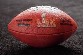
The Super Bowl LIX logo continues the tradition of using Roman numerals, with “LIX” prominently displayed. The color scheme features bold shades of red, silver, and navy blue, which some believe give it a modern and sophisticated look. The Lombardi Trophy, a staple in Super Bowl logos, remains the focal point, centered above the numerals. However, what stands out this year is the geometric style of the font and an added background element that appears to symbolize the host city, New Orleans.
The NFL‘s reasoning behind the design was to incorporate elements that represent both the history of the game and the culture of the host city. The Super Bowl returns to New Orleans for the first time since 2013, and the logo reflects a mixture of football prestige and the city’s lively atmosphere. The sharp angles and metallic gradients of the letters are meant to signify strength, while the background showcases elements inspired by the famous French Quarter’s wrought iron designs.
Fan Reactions: Love It or Hate It?
As soon as the logo was revealed, social media was flooded with opinions. Some fans praised the design for being sleek, bold, and a departure from previous Super Bowl logos that have followed a more uniform template.
“I love that they finally added something different! The colors really pop, and it feels more unique,” one user tweeted.
However, not everyone is impressed. Many are criticizing the logo for being too generic or even confusing. Some pointed out that the geometric font makes the Roman numerals harder to read at a glance. Others have complained that the color scheme lacks the vibrancy expected from a Super Bowl held in New Orleans, a city known for its bright and festive spirit.
“This doesn’t scream New Orleans to me. Where are the gold and purple elements? It feels too cold for such a lively city,” another fan commented.
A Shift in Super Bowl Branding?
For years, the NFL used highly stylized Super Bowl logos that incorporated themes from the host cities. However, in recent years, the league has leaned toward a more standardized look with only minor variations. The Super Bowl LIX logo seems to be a mix of both—the traditional structure remains, but the addition of city-inspired elements marks a slight departure from the rigid designs of the past decade.
This move has left fans divided. Some believe it signals a positive shift, allowing each Super Bowl to have a more personalized identity. Others worry that the league is stuck in a repetitive cycle where every logo looks too similar despite minor tweaks.
How It Compares to Past Logos
Looking back, the most iconic Super Bowl logos often had bold and unique designs. The Super Bowl XXXVI logo, for example, featured the fleur-de-lis, a clear nod to New Orleans when the game was last held there. The Super Bowl XX logo from 1986 is another fan-favorite, featuring bright colors and a distinctive shape that made it stand out.
In contrast, recent logos, particularly since Super Bowl LI, have followed a more corporate, structured format, often using silver and blue tones. The new Super Bowl LIX logo attempts to break free from this pattern, but some argue it doesn’t go far enough to recapture the creativity of the past.
The Marketing Impact
Logos play a major role in branding and merchandise sales. Jerseys, hats, posters, and memorabilia featuring the Super Bowl logo will flood the market leading up to the game. A well-received design can drive excitement and sales, while a controversial one could become a talking point for the wrong reasons.
Regardless of the mixed reception, the logo will be everywhere—on promotional materials, TV broadcasts, and official NFL gear. Some marketing experts believe that even negative reactions can work in the league’s favor by keeping the conversation going. After all, any publicity is good publicity when it comes to the Super Bowl.
Looking Ahead to Super Bowl LIX
The debate over the logo will likely continue for months, but one thing is certain: Super Bowl LIX in New Orleans is set to be an unforgettable event. With the city’s rich football history, legendary fan base, and world-class hospitality, the game will be about much more than just a logo.
As fans prepare for the 2025 Super Bowl, the real question remains—will the game itself live up to the hype? And will history look back on the Super Bowl LIX logo as a bold step forward or a missed opportunity?
Only time will tell, but for now, the logo remains one of the most talked-about aspects of the upcoming Super Bowl season.
2025 WNBA Mock Draft: Predicting the Next Superstars in the League